Friday, May 22, 2009
Preview Art
Guest Editor: Norman Crisologo
Introduction: Erwin Romulo
Lay-out: Auggie Fontanilla
Preview
Team Editor: Pauline Suaco-Juan
Team Creative Director: Vince Uy
Team Associate Publisher: Ichi Apostol
To celebrate its 150th issue, Preview launches Preview Art, a stunning, limited edition collection of images from the Philippines' most provocative visual artists. Curated by art collector and frequent Preview collaborator Norman Crisologo, Preview Art, through the works of Elmer Borlongan, Ronald Ventura, Geraldine Javier, Tatong Torres, Costantino Zicarelli, Liv Vinluan, Juan Caguicla, Wawi Navarrosa, Steve Tirona, Rajo Laurel, Ivarluski Aseron and Joey Samson.
GOOD JOB guys and gals!!!!!!! :-)
Tuesday, February 10, 2009
The Starmall renovation projects
I always believe that you get your next project from your last (excellent) project. That's enough reason to keep doing the best job you can.
I think The Manuela Corporation people took note of the work I did with the Ayala Malls and thought I could do something with their malls. The work that began with the renovation of Starmall EDSA grew - we then worked on Metropolis Alabang (now Starmall Alabang), and MStar Las PiƱas.
Thin budgets constrain developers to completely tear down old malls and create new ones. The solution: renovation. That was my job: renovate an old mall to make it look like a new and inviting mall. That was what I was set out to do.
I'm VERY proud of the work I did with Manuela. With a great great team (client, suppliers AND contractors), I think we were able to accomplish the job.
With careful design, coordination and new materials, I told the team - we have to do it QUICKLY - so as the people don't even notice that we are actually just covering the facade with new color, materials and design (I wanted to cover the whole building a la Christo while we were at work - but there was no budget for it).
I think we did it. When the Starmall EDSA facade was done, I had comments that the building was "bigger". Some people thought Starmall was part of EDSA Shang-gri-la Mall. I'd like to think that the investment the clients made on me, construction and production came back to them a hundredfold. A new lease on life for an old mall.
When we started the project Manuela Mall was in a word: scary. When we did the job, it was a complete turn around. I remember watching people come in (I was thrilled when women came into the mall - women hardly came into Manuela before the renovation). The Manuela projects were very fulfilling - it's absolutely wonderful when the design you see in your mind comes into reality!
Labels:
Environmental Graphics,
facade,
interiors,
space design,
starmall
Alabang Town Center Environmental Graphics
Before I was commissioned to do the Alabang Town Center (ATC) Entertainment Area design, the first job was to design and create the environmental graphics for the mall.
I remember I knew what I wanted to do with ATC. I wanted to create a "Filipino" mall - a real classy, sophisticated "Filipino" mall we could call our own. ATC already had somewhat a "Spanish / Mediterranean" architecture which I thought could work with the Filipino concept.
At first client was not so crazy about placing "jeepney" images in their upscale mall but once we made a prototype (we made a mall directory), they knew exactly what I wanted to do and they gave me a go ahead.
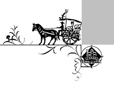
Thus when you go to Alabang Town Center - you will be able to see kalesas, jeepneys decorating mall posts. The restroom is called a "banyo" with male and female icons in a barong and baro't saya. A certain part of the mall has icons of a Filipino market or "palengke".
A truly classy and sophisticated Filipino mall! :-)
Alabang Town Center Entertainment Center
Not a lot of graphic designers / artists / illustrators design spaces and I think that is precisely why I LOVE doing it.
Alabang Town Center (ATC) Entertainment Center will always be one of my favorite projects. The dream team was a joy to work with - Belen Javier, Carina Go and the rest were amazing. Everyone wanted the BEST (at the lowest cost), and I think that is why we got along so well.
The job was to make a new look for a very old building - at minimum budget. At first I thought of a Metropolitan Museum / turn of the century look (to go along with the Spanish / Filipino architecture of the rest of the mall) but they client wanted something modern and contemporary - I understood why.
We designed everything - graphics, layout, facade, store guidelines, ceilings, floorings (our motto - "God is in the details") - there was a time I myself would be painting murals (I remember a security guard recognizing me as a TV host and wondering what I was doing painting a mural at the job site late late at night). People have preconceived notions of what TV people are - but then again I'm was really never a TV person.
I really liked ATC and the whole experience of creating it. I miss the people and ATC will always be special to me.
Subscribe to:
Posts (Atom)